Enjoyed reading this article on Mercury, but it reminded me how difficult astronomical scales are to imagine.
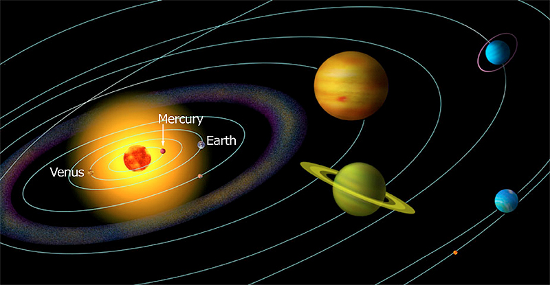
This is how we are often showed an image of the solar system:
Or somewhat less obviously distorted like this:
Either of these images badly distorts the sizes of the planets, but they also badly distort the size of the sun. Even actual images of Mercury against the sun are hard to reconcile with real distances and sizes. This image makes it look like Mercury is very close to the sun (and oddly enough makes it look larger, relative to the sun than it actually is):
Try this image:
Those circles are orbits to scale, and the yellow dot in the center? That's the sun also to scale. The sun is huge but Mercury (black circle) orbits at a distance of 0.38 a.u., which is 41x the diameter of the sun--Venus is the gold circle, Earth blue and Mars red. Also, none of the planets are visible at this scale. The largest of this group, Earth, is .01 times the diameter of the sun, so if that sun were 100 pixels wide, Earth would be 1.
So as close as mercury is to the sun, it's still a fair distance (relative to the size of the sun), and the sun does not fill its sky (if you were on the surface of Mercury the sun would appear a bit less than 3x the diameter--9x the area--than it does here on Earth).
That last image isn't as nice to look at but our MASSIVE sun is still a tiny dot compared with the orbits of even the very close planets in our stellar system. The outer planets make these orbitals seem small, and our entire planetary system is a speck in the Milky Way which is less than a spec in the universe overall.


.jpg)

No comments:
Post a Comment